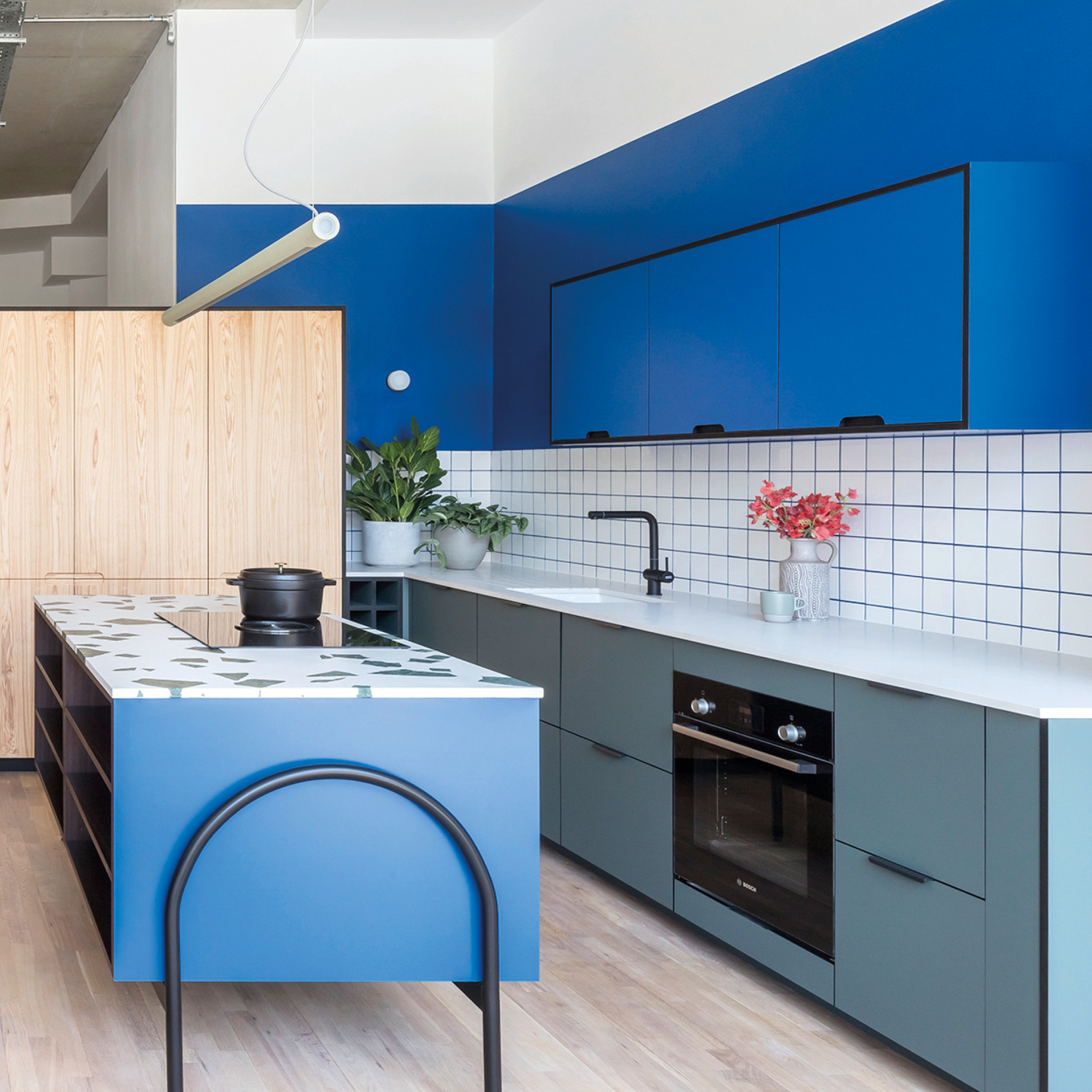
The power of colour in the home
 Fict Studio
 Amidst the pandemic; the biggest disruption to modern life in many generations, it may sound frivolous to talk about something as ‘trivial’ as colour in the home. But with so many people struggling with the fear that economic uncertainty, isolation and endangered health brings, colour may well be one of the most transformative experiences in their homes right now.
The home and everything we seek to bring into it is an opportunity for either soothing and healing or prompting joyful emotions. Our consumer insight research shows that we use colour to shape our environments to deliver specific experiences, whether that is to calm us and make us feel safe, or to inspire and delight our senses.
The Aesthetic of Joy
Our trend forecasts for 2021 and 22 were already highlighting a shift towards richer shades and bold combinations. After a decade of calming minimalism, people are simply becoming tired of the sameness that interior design trends have delivered for so long. For braver customers, this might lead to daring maximalist choices and clashing combinations of lilacs, pinks and yellows but for more conservative shoppers, perhaps a terracotta highlight or warmer neutral for their bedroom wall.
Applied Colour Psychology Expert Karen Haller describes how we are entering an exciting new phase where the emotional human connection we have with colour can greatly enhance our lifestyles. She explains “From a consumer perspective, there is a real thirst for colour right now. People are driving more colourful cars, dying their hair more colourful hues, consumers are really embracing the opportunity to bring more colour into their lives which isn’t surprising seeing as we have come out of a decade or more of living in white and grey.”
Colour as Therapy
In our 2021 macro trend forecast “Healthy Home”, we spent some time investigating the emerging study of Neuroaesthetics (the power of visual stimulus to elicit neurological responses) and Chromotherapy (the use of colour to heal). These practices were already gaining a cult following amongst the design community, but in recent months, with the WHO officially recognising work-place burnout as an occupational illness and the Pandemic putting mental health issues front of mind, we’ll increasingly see them seeping into more mainstream messaging around colour.
Karen also describes how colour psychology is an increasingly important consideration for neuroscientists, biologists, physicists, philosophers and psychologists, and research is continually expanding our knowledge of how we take colour in and how we emotionally respond to it. “As designers, this is a wonderful opportunity for us to capitalise on the use of colour in our designs. When we are more mindful and purposeful in how we use colour, we can really influence and impact the experience that people have in a positive way. We can enhance their wellbeing, their mental health, their productivity at work, their relaxation at home, and so, so much more.”
So, could 2020 signal the end of wall to wall grey as a trend? Surrounded by the same four walls for several months, householders may be thankful they opted for that slightly braver shade or craving an injection of colour to brighten their daily lives.
Trend Bible’s Colour Direction for 2021 outlines six shades chosen by our colour experts and are based on our seasonal trend forecasts for 2021. These directional, yet commercially viable shades represent what we believe to be central to life at home. Download our free 2021 Colour Direction report here for more colour in the home inspiration. Click the ‘Free Download’ button on this post.